
JETOUR Auto Malaysia has introduced a new corporate logo, using Malaysia as the launchpad for a broader brand repositioning that will shape its product and market strategy heading into 2026.
More than a visual refresh, the move reflects the company’s intent to sharpen its travel-and-adventure positioning while laying the groundwork for its long-term goal of becoming a major player in the hybrid off-road space.
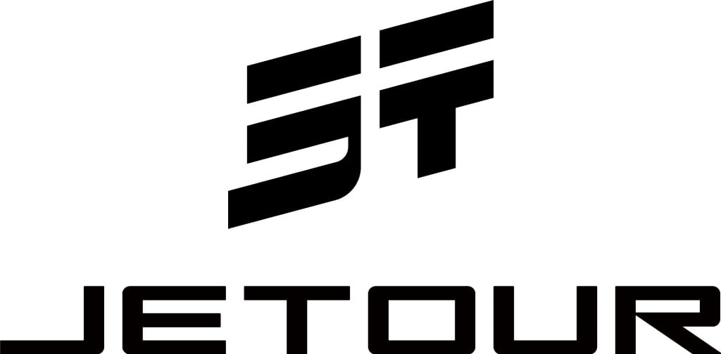
The redesigned emblem is built around the Chinese character “行” (xing), a symbol of forward motion and progress, with the letters J and T subtly integrated into the form.
The result is a mark that communicates movement and connectivity — themes that sit at the core of the brand’s direction as it pushes beyond conventional SUV messaging into a lifestyle-driven mobility proposition.
This shift is closely tied to JETOUR’s “Travel+” framework, which extends the brand beyond vehicles into a broader ecosystem. On the product front, the strategy emphasises all-terrain capability, large and flexible cabin space, intelligent control systems and electrified efficiency.
Surrounding that is a lifestyle layer that includes accessories, vehicle personalisation, travel-focused user benefits and dedicated touchpoints designed to support road-trip and outdoor usage.
Malaysia plays a strategic role in that plan. The market’s mix of urban usage and destination travel culture mirrors the brand’s intended use case, making it a natural base for regional expansion.
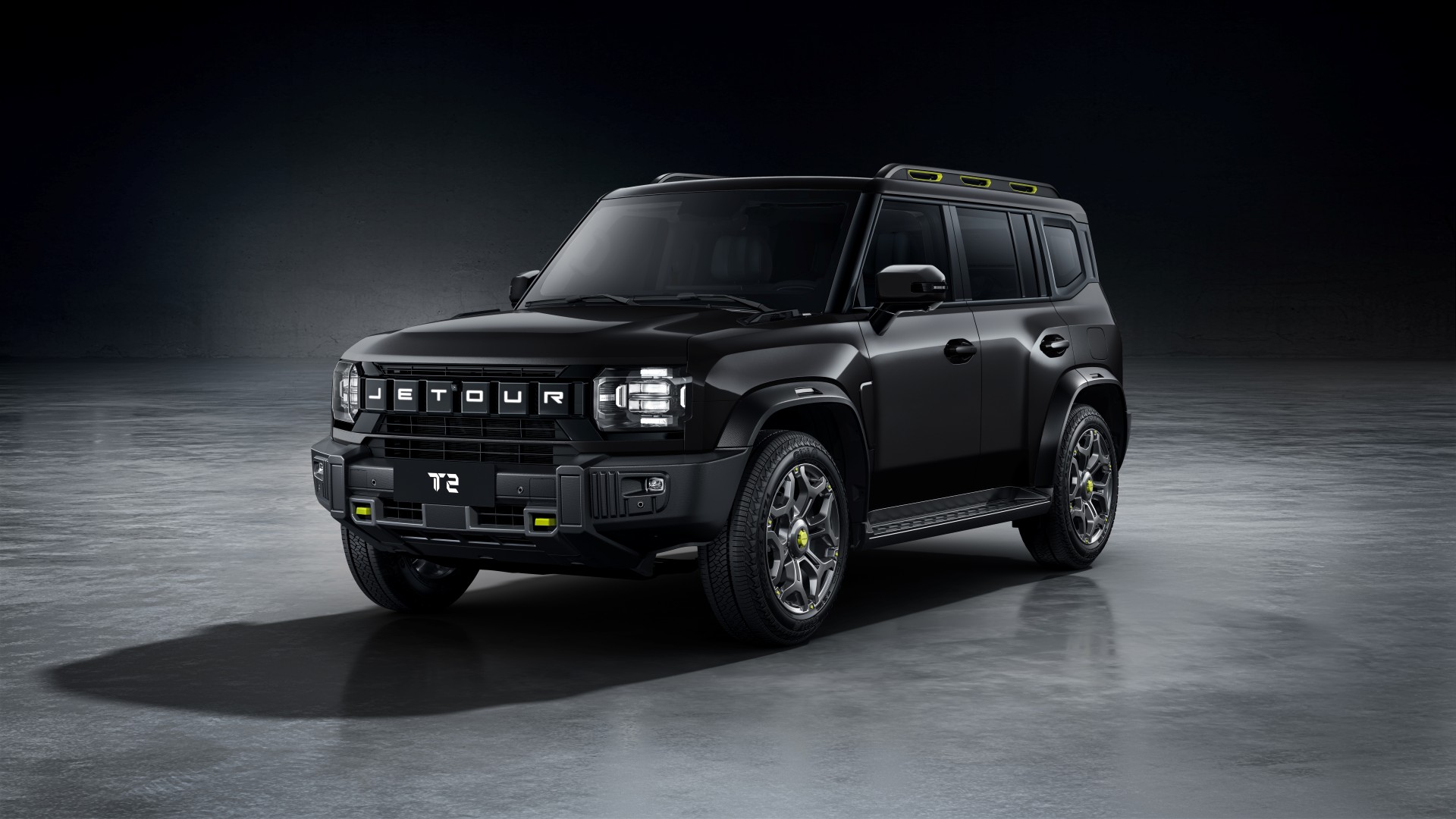
With a wider line-up — including the upcoming T-Series models — set to arrive, the new identity serves as a marker of JETOUR’s transition from market entrant to a brand building long-term presence and recognition.
In essence, the logo debut is less about aesthetics and more about signalling intent: a clearer positioning, a more defined product roadmap and a stronger push to embed the brand within Malaysia’s growing adventure-oriented SUV space.